A high-converting landing page is one of the key parts of any marketing strategy. If your landing pages are not bringing in valuable leads, it’s time you revisit the approach you took for creating them.
The sole purpose of a landing page is to convert visitors and if it’s not doing that, it’s clear that elements on the page are having the effect they are supposed to. It’s true that there’s no one-size-fits-all strategy that you can implement, and considering the different types of landing pages that are there, you can’t pick one plan of action.
However, there are certain things that remain constant and act as the foundation of a good landing page. In this blog, I’ll talk about all the details that marketers have to pay attention to for creating a high-converting landing page. But before I move to the main part let’s talk briefly about what a landing page is.
What is a landing page?
A landing page is any standalone page that can act as a way to capture leads. It can be a homepage, a page specifically created for a campaign or a referral page. Each of these pages will have different purposes and need to be created accordingly.
Consider for example a blog page- the purpose of this page is to attract visitors who want to be educated about your industry or the service that you provide.
While there are different types of landing pages, they are mostly created for specific campaigns. This way marketers can effectively track the performance of their campaign and see how many leads are generated through that particular campaign.
The main thing that you have to keep in mind is that a landing page should encourage a visitor to share their personal information. Now, to ensure that that happens, you’ll have to create a good enough landing page. Let’s see how you can do that.

How to Create a High-Converting Landing Page
1. Create a compelling headline and copy
Content is the center point of every marketing strategy. This means that if your content lacks substance, your campaign will likely not bring in the desired results. The same goes for landing page content.
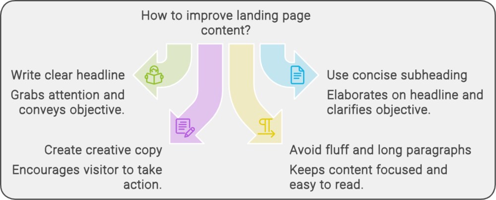
As soon as a visitor lands on the page, they should know its objective. How can you do that? By writing a clear and concise headline. The headline should ideally be short, and to the point, and pique the interest of the visitor. Since the headline has to be short, you cannot possibly convey the purpose of the page through it alone, you will also need a good subheading.

Now, the subheading will elaborate a little on the headline and should ideally make the objective of the landing page clear. Next comes the copy! Just like the headline, your landing page copy should be to the point and creative enough to encourage the visitor to fill out the form. Try to ensure that there’s no fluff content or long paragraphs and that you are speaking directly to the visitor.
2. Include high-quality images
These days people are more likely to respond to images than just plain text. Visual content is more engaging and helps visitors understand your offering in a much better way. However, you can’t just stick any image on the page and expect people to respond to it in a positive way.
Make sure that the image is of high quality and is related to whatever service or product you are offering. Additionally, if you are able to put an image that explains the aim of the particular landing page then nothing like it. Visual content is a great way to enhance user experience and your campaign can witness better results if you leverage it properly.
3. Keep forms short and visible
The form is one of the most important parts of your landing page. But, if you are not careful about the sort of information you ask for, you may risk driving a potential lead away. Of course, you’d like to get as much information about visitors as possible, however, asking for way too many data points may backfire.
Ideally, ask for as little information as possible. If you think that just the name and email id can fulfill your purpose then there’s no need to ask for a phone number or company name as well.
Also, you can put the form above the fold so that the visitor can get to the main task immediately. There’s also the option of designing the form in a way that it scrolls along with the rest of the page. That way the visitor will never lose sight of the form and might feel more compelled to fill the form.
4. A call to action that stands out
When we talk about landing pages, it’s pretty obvious that it has to have a CTA. But remember, the CTA on your landing page has to be compelling and clear. It has to convey what the visitor is signing up for in just a couple of words.

The CTA button should stand out, be clear, and be able to catch the eye of the visitor. You can use vibrant colors that are in contrast with the rest of the colors on the page. The button shouldn’t be too small so that the visitor doesn’t notice it. And lastly, to emphasize again, make sure you get to the point straight away.
5. Optimize your landing pages for different devices
As you might already know, people these days use different devices for browsing. Therefore, if you create the landing page just for the desktop and fail to optimize it for mobile devices, you may see higher bounce rates.
Make sure that you are creating responsive pages to provide an enhanced user experience regardless of the device visitors are using.
6. Include testimonials and social proof to convince visitors
Testimonials are a great way to convince visitors to go for your product or service. You can put in video testimonials, quotes from your existing customers, or use case studies to make your point.
Another thing that may help you convert more visitors is social proof. Are you working with some well-known brands? Great! Put their names and logos on the landing page. Has your company recently won some accolades? Good for you! Throw in the names of brands that featured your company.
This way you are essentially letting visitors know that you are not a rookie, other brands are already benefiting from your product/service.
7. End with a ‘Thank You!’ page
Once you are done with all the key elements of your landing page make sure to include a ‘Thank you’ page. The visitor should be directed to a thank you page after they fill out the form and click on the CTA. It’s an easy way to be polite and thank the user for their interest in your offering.

Best Practices
-
- Before ending this blog, I wanted to highlight some points that you have to take care of or you should avoid for creating a kickass landing page:
- Don’t put ads on landing pages. It’s a really bad idea to put ads on such pages because firstly, they will probably serve no purpose, and secondly, you will probably end up violating Google’s policies.
- Ensure that the content above the fold is crisp. Whether you are putting the form in the first fold, an image, or social proof, you have to make sure that the content is good enough to instantly grab the attention of the visitor.
- Design the landing page by keeping in mind your target audience. If your landing page successfully represents your audience, then the chances of converting visitors into leads are higher.
- Make sure to demonstrate clearly what problems your service or product can solve and how it will benefit the visitor.
Final Thoughts
There you have it, all the important things you need to consider to make an excellent landing page! Once you understand your target audience, all the other elements will fall into place. You just have to make sure to pay attention to all the constants that I have mentioned above and build a strategy accordingly.
The average conversion rate for landing pages is 2.35%. However, if you put in the needed efforts, you will end up getting the desired results.

