How to Choose the Right GoDaddy Website Template for Your Business

A visually appealing and user-friendly website can significantly impact your online presence and ultimately drive success for your business. So, why settle for anything less than the best when it comes to choosing a website template? That’s where GoDaddy comes into play with its wide range of website templates to cater to every business need.

When it comes to selecting the right GoDaddy website template, there are several factors that you should consider. First and foremost, think about your business goals. What do you want to achieve with your online presence?

Are you looking to boost your website SEO and increase website traffic? Or perhaps you want to improve your website conversion rate and generate more leads? Understanding your objectives will help guide you in choosing a template that aligns with your marketing strategy. 

Your website should cater to their needs and provide them with an exceptional user experience (UX). This means selecting a template that reflects their interests, speaks their language, and resonates with their values. 

Connecting with your target audience on an emotional level is essential for building brand loyalty and driving customer engagement. Budget plays a significant role in any decision-making process, including selecting the right GoDaddy template for your business. 

It’s essential to have clarity on how much you’re willing to invest in website development as well as ongoing expenses such as web hosting fees.

GoDaddy offers various pricing options tailored to different budgets so that every entrepreneur can find a suitable solution without compromising on quality. With more people accessing websites through smartphones and tablets than ever before, having a mobile-optimized design has become non-negotiable. 

A responsive design ensures that your website looks great and functions seamlessly across all devices, providing a consistent user experience regardless of the screen size. As you embark on this journey of selecting the right GoDaddy website template for your business, remember to keep your goals in mind, prioritize your target audience’s needs, stay within budget, and embrace the power of mobile-friendly design.

By doing so, you’ll be well on your way to crafting a website that not only reflects your brand but also captivates visitors and drives meaningful results. Take advantage of GoDaddy’s extensive range of templates and make a lasting impression in the digital realm.

The importance of having a well-designed website for your business

The importance of having a well-designed website for your business cannot be overstated. A well-designed website not only attracts visitors but also keeps them engaged and encourages them to explore further. It’s all about creating an enticing customer journey that seamlessly guides users from one page to another with minimal effort. 

A visually appealing interface coupled with intuitive navigation can do wonders for your business’s image and credibility. Trust me when I say that customers are more likely to trust a company with a sleek and professional-looking website. Let’s not forget about marketing strategy! Your website serves as a powerful tool in your marketing arsenal.

It allows you to showcase your products or services in all their glory and tailor the content to resonate with your target audience. With the right design elements and branding, you can captivate visitors’ attention and convert them into loyal customers. 

Mobile-friendly websites are non-negotiable if you want to stay relevant in the digital landscape. The majority of internet users access websites through their smartphones or tablets, so having a responsive design that adapts seamlessly across different devices is imperative. 

Google also favors mobile-friendly websites when it comes to search engine rankings – another reason not to neglect this aspect. So here we are at a crossroads: Do you take the plunge into professional web development or opt for an off-the-shelf solution? 

Various GoDaddy Templates

GoDaddy Website Templates offer a perfect combination of affordability and flexibility – just what every budget-conscious entrepreneur desires. With these templates at your disposal, building a visually stunning website that aligns with your business goals becomes a breeze. 

The different types of GoDaddy website templates available

When it comes to choosing the right website template for your business, GoDaddy offers a plethora of options to suit every need. From sleek and modern designs to classic and elegant layouts, their extensive collection caters to a wide range of industries and preferences. One type of GoDaddy website template that deserves special mention is the e-commerce template

If you’re in the business of selling products or services online, these templates are specifically designed to optimize your website for maximum conversion. With built-in features like secure payment gateways, product galleries, and shopping carts, these templates make it incredibly easy for you to showcase your offerings and streamline the customer journey.

GoDaddy also offers business templates that exude credibility and establish a strong online presence. These templates often include sections dedicated to highlighting your company’s mission statement, team members’ profiles, testimonials from satisfied clients, and even integration with social media platforms.

With these powerful tools at your disposal, you can effectively convey your brand’s story while building trust with potential customers. Another popular category of GoDaddy website templates is the portfolio templates.
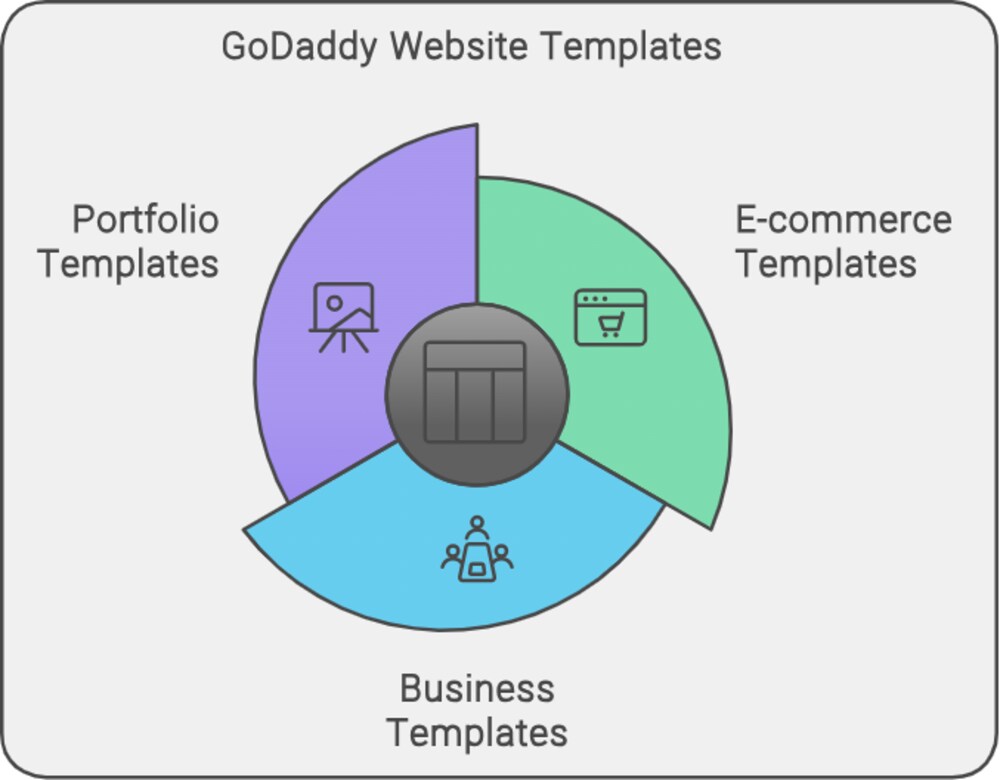
Types of GoDaddy Website Templates

Ideal for creative professionals such as photographers, designers, or artists looking to showcase their work in an aesthetically pleasing manner, these templates offer stunning visuals combined with user-friendly interfaces (UI). They provide various options for displaying portfolios in grids or sliders while allowing customization options like color schemes and fonts that align with your branding. 

When exploring the different types of GoDaddy website templates available on their platform – be it e-commerce-focused designs tailored towards boosting sales conversions or professional business-oriented layouts aiming at establishing credibility – there is undoubtedly something suitable for every industry niche.

By carefully selecting the right template that aligns with your brand’s vision and target audience preferences while keeping an eye on budgetary considerations – businesses can harness the power of visually appealing web design paired with seamless functionality provided by GoDaddy to elevate their online presence and drive success. 

How to choose the right GoDaddy website template for your business

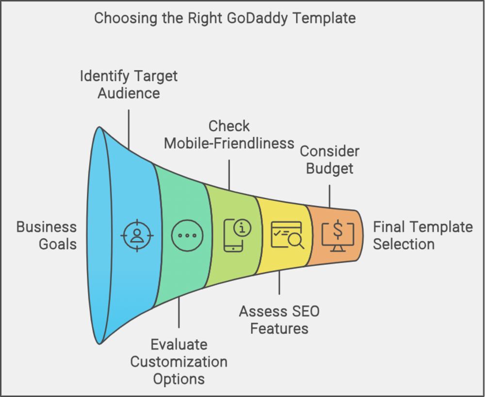
Choosing the right GoDaddy website template for your business can be a daunting task, but fear not! I am here to guide you through this treacherous journey. First and foremost, consider your business goals. 

What is it that you want to achieve with your website? Is it to generate leads, sell products, or simply establish an online presence? 

This is crucial because different templates cater to different objectives. Next, think about your target audience. 

Who are they? What are their needs and preferences? 

A template designed for a young and trendy audience might not resonate with an older demographic. So put yourself in their shoes and choose a template that speaks directly to them. The user experience is paramount when it comes to capturing attention and converting visitors into customers. Now let’s talk about customization options. 

Look for a template that offers flexibility in terms of design elements, color schemes, font choices, and layouts. You want a website that reflects your brand identity and stands out from the crowd. Don’t settle for generic templates that make your website look like a carbon copy of countless others out there. Make sure the template you choose is mobile-friendly.

Having a responsive design is non-negotiable where people access websites from various devices. A mobile-friendly website enhances the user experience improves your website’s SEO and increases its chances of ranking higher in search engine results. 

A good website template should provide easy integration with essential SEO elements such as meta tags, keyword optimization, image alt texts, and structured data markup. These features will help improve your website’s visibility in search engines and drive organic traffic.
GoDaddy website

While investing in a high-quality template can bring immense value to your business in terms of branding and customer trust, there’s no need to break the bank. GoDaddy offers a range of website templates that cater to different budgets, so you can find one that aligns with your financial constraints. 

Choosing the right GoDaddy website template requires careful consideration of your business goals, target audience, customization options, mobile-friendliness, SEO features, and budget. It’s a delicate dance between aesthetics and functionality.

Armed with these insights and armed with Godaddy’s vast array of templates at your disposal, you are now ready to embark on your website development journey with confidence and swagger.

Consider your business goals

This is the foundation upon which every decision you make for your website should be built. Your website should be a reflection of your business goals and aspirations, serving as an online representation of your brand and identity. Before you dive into the vast ocean of GoDaddy website templates, take a step back and evaluate what you want to achieve with your online presence

Are you looking to increase website traffic and generate leads? Are you aiming to boost your website conversion rate

Do you simply want to establish a strong online presence that aligns with your branding efforts? Understanding your business goals will help guide you in selecting the right GoDaddy template that can effectively support these objectives.

When considering your business goals, keep in mind that a visually appealing website is not enough. It needs to be strategically designed and optimized for search engine visibility. This means paying attention to important elements such as website SEO and responsive design.

A template that offers built-in SEO features or mobile-friendly options can greatly enhance your chances of ranking higher on search engine result pages, driving organic traffic to your site. think about how the chosen template can complement other aspects of your marketing strategy.

If content marketing plays a pivotal role in attracting and engaging customers, ensure that the template provides ample space for compelling website content. The template integrates with social media platforms or email marketing tools if these are integral components of your marketing arsenal. Choosing the right GoDaddy template requires careful consideration of your business goals. 

It’s not just about finding an aesthetically pleasing design; it’s about finding a template that aligns with your branding efforts, supports effective SEO practices for enhanced visibility in search engines, complements other aspects of your marketing strategy such as content creation and social media integration, all while being mindful of budget constraints.

By taking all these factors into account, you can set your website on the path to success and ensure a positive user experience for your target audience. 

Think about your target audience

When choosing the right GoDaddy website template for your business, one crucial aspect you must consider is your target audience. After all, what good is a beautifully designed website if it fails to resonate with your intended customers?

So before you get caught up in the aesthetics and functionality of different templates, take a moment to think about who your audience is and what they want. You need to understand the demographics of your target audience. Are they young or old? 

Tech-savvy or technologically challenged? Are they primarily male or female? 

These details will help you determine the overall look and feel of your website. If your target audience consists mainly of millennials, incorporating trendy design elements and utilizing a modern user interface (UI) will likely appeal to them.

On the other hand, if your customers are older individuals who may not be as comfortable with technology, a simpler and more intuitive UI might be more appropriate. Beyond demographics, consider the specific needs and preferences of your target audience. 

What are their pain points? What are their desires? 

By speaking directly to these aspects through thoughtful design choices, you can establish an immediate connection with potential customers. For example, if you’re running an e-commerce business selling eco-friendly products targeting environmentally conscious consumers, incorporating nature-inspired visuals and emphasizing sustainability in both content and design will speak directly to their values. 

The ultimate goal is not just to attract visitors but also to convert them into paying customers. By tailoring your website template specifically for your target audience’s preferences and needs, you can create a user experience (UX) that not only grabs attention but also guides visitors toward taking desired actions such as making purchases or signing up for newsletters.

Don’t underestimate the power of understanding your target audience when choosing a GoDaddy website template for your business. By aligning the design choices with their preferences and needs, you can create a website that not only attracts visitors but also converts them into loyal customers. 

So take the time to dive deep into your audience’s psyche, study their demographics, and incorporate key elements that resonate with them. Only then will your website truly become a powerful marketing tool for your business.

Choose a template that is easy to use and customize

When it comes to choosing a website template for your business, one of the crucial factors to consider is how easy it is to use and customize. not all of us are tech-savvy web developers or graphic designers. 

We need a template that doesn’t require a Ph.D. in coding or an eye for aesthetics to make it look professional. This is where many GoDaddy website templates fall short. GoDaddy offers a wide range of templates that cater to various industries and styles. Some of these templates can be clunky and overly complicated. 

They bombard you with countless options and features that only add confusion rather than enhance the user interface (UI). It’s like trying to navigate through a labyrinth of unnecessary widgets and plugins just to change the color scheme or add a simple logo.

Customization options can often be limited or convoluted. You want your website design to reflect your brand identity and vision, but with certain GoDaddy templates, you may find yourself shackled by their rigid structures. 

It’s frustrating when you’re unable to modify the layout or rearrange elements according to your preferences without resorting to complex workarounds or hiring an expensive web developer. Finding a template with an intuitive drag-and-drop editor is essential for non-technical entrepreneurs who want their websites up and running smoothly without tearing their hair out in the process. 

The ability to easily customize colors, fonts, images, and content should be at your fingertips without needing extensive knowledge of HTML or CSS. After all, isn’t the whole point of using website builders like GoDaddy’s templates supposed to simplify website development? 

Choose a GoDaddy website template that prioritizes simplicity and user-friendliness over unnecessary complexity. Don’t settle for convoluted options that leave you feeling overwhelmed and constrained in your creativity. Your business deserves a website that not only captures the essence of your brand but also empowers you to make changes and updates effortlessly. 

Make sure the template is responsive

When it comes to choosing a GoDaddy website template for your business, one of the key factors you need to consider is whether the template is responsive. If your website is not mobile-friendly and fails to adapt seamlessly across various devices and screen sizes, you’re essentially shooting yourself in the foot. A responsive design is crucial for numerous reasons. 

It ensures that your website looks visually appealing and functions optimally regardless of the device being used. With an increasing percentage of website traffic coming from mobile devices, neglecting the importance of a mobile-friendly design can severely impact your user experience (UX) and ultimately harm your business goals. 

A non-responsive website can significantly hurt your search engine optimization (SEO) efforts and make it harder for potential customers to find you online. So why would anyone willingly choose a template that ignores something as crucial as responsiveness? 

Imagine having invested time, effort, and money into crafting compelling website content with carefully curated images and videos. Now picture all those efforts going down the drain simply because your chosen GoDaddy template fails to deliver a mobile-friendly experience.

It’s like pouring all your resources into an exquisite brick-and-mortar store only to close its doors during peak hours. Don’t let such negligence sabotage your chances of success. When selecting a GoDaddy website template, prioritize responsiveness above everything else.

Don’t compromise on this vital aspect because ensuring optimal user experience across different platforms will not only boost your credibility but also contribute to better conversion rates. investing in a responsive design sets the stage for an effective marketing strategy by providing users with seamless navigation options regardless of their device or screen size. 

Let’s demand excellence and ensure that our chosen GoDaddy website template is responsive, providing users with a visually stunning and highly functional experience. After all, a successful business is built on solid foundations, and a mobile-friendly website design is undoubtedly one of them. 

Consider your budget

When it comes to choosing a GoDaddy website template for your business, your budget should be at the forefront of your decision-making process. While it may be tempting to splurge on the most elaborate and visually stunning template available, you must exercise caution and consider the long-term financial implications. 

Before making any rash decisions, take a step back and evaluate your budgetary constraints. Assess how much you are willing to invest in your website development and maintenance. Remember that a website is not just a one-time expense; it requires continuous care and updates to keep up with evolving trends and technology.

Consider costs such as web hosting, domain name registration, ongoing SEO efforts, and potential expenses related to customizing or modifying the template. 

It is important to strike a balance between cost and quality. While you don’t want to settle for an inferior template that screams “cheap” to anyone who happens upon your site, it is equally important not to break the bank unnecessarily. 

Look for GoDaddy website templates that offer a good value proposition – ones that align with your marketing strategy while keeping costs within reasonable boundaries. Investing wisely at this stage will allow you more room for other essential aspects of website development, such as engaging content creation or targeted online advertising campaigns. 

When considering your budget for choosing a GoDaddy website template for your business, make sure you have a clear understanding of what you can afford both now and in the future. Be cautious not to overspend on fancy bells and whistles that may do little more than drain your resources without delivering any substantial return on investment (ROI). 
Customer Feedback and Reviews

Prioritize functionality over flashiness and seek out templates that strike the right balance between affordability and quality – ones that align with your brand’s identity while respecting financial limitations. By doing so, you will be making a wise financial decision and setting the foundation for a successful online presence that can truly support your business objectives. 

Conclusion

Choosing the right GoDaddy website template for your business is not a task to be taken lightly. It requires careful consideration of various factors, including your business goals, target audience, ease of use, responsiveness, and budget. While GoDaddy offers a plethora of website templates to choose from, it is essential to remember that not all templates are created equal.

Consider your business goals when selecting a GoDaddy website template. Are you looking to drive more website traffic? Whatever your objectives may be, make sure the template you choose aligns with these goals.

A visually appealing template may attract visitors initially but if it doesn’t effectively communicate your website content or facilitate a seamless user experience (UX), it will fail to convert those visitors into loyal customers. Think about your target audience when making this decision. 

With the majority of internet users accessing websites through their mobile devices, neglecting responsive design could lead to missed opportunities and frustrated visitors. Consider how easily your chosen template can adapt to different screen sizes and ensure that the overall user experience remains consistent across devices. 

While some may argue that budget should be the primary factor in selecting a GoDaddy website template, prioritizing affordability over quality can often result in long-term setbacks for your business. Investing in an aesthetically pleasing and functional template might require some extra financial commitment upfront. Still, it pays dividends in terms of improved search engine optimization (SEO), increased customer engagement, and, ultimately, higher revenue generation. 

Choosing the right GoDaddy website template involves balancing multiple factors such as business goals, target audience considerations, ease of use and customization options, responsive design principles, and budget constraints. The template you choose should be an effective tool for driving website traffic, enhancing user experience (UX), optimizing search engines, and achieving your business objectives. 

A well-designed and thoughtfully selected template can distinguish between a website that simply exists and one that truly thrives in the competitive online marketplace. 

Tips for choosing the right GoDaddy website template

When it comes to choosing the right GoDaddy website template, there are a few tips that can help you make an informed decision. Consider your business goals. Are you looking to create a sleek and professional website for an online store? 

Or maybe you want to showcase your portfolio in a visually stunning manner. Whatever your goals may be, make sure the template aligns with them. 

Templates that have a user interface (UI) that is intuitive and easy to navigate. A cluttered or confusing layout will only drive visitors away from your site. 

Choose a template that is mobile-friendly and responsive. Where more than half of website traffic comes from mobile devices, having a responsive design is crucial. You want your site to look flawless on smartphones and tablets as it does on desktop computers. This not only enhances the user experience but also improves your website’s SEO (search engine optimization) ranking. 

Consider your budget as well when selecting a GoDaddy website template. Other expenses such as domain name registration, web hosting, and ongoing maintenance will also need consideration. Keep in mind the importance of website content and conversion rates when making your selection. 

Look for templates that offer features like clear call-to-action buttons or sections where you can highlight testimonials or client reviews. 

Choosing the right GoDaddy website template requires careful consideration of various factors such as business goals, target audience preferences, mobile-friendliness, budget, and conversion rate optimization.

By keeping these tips in mind, you can confidently select a template that not only looks stunning but also helps you achieve your business objectives and ultimately drives success in your online endeavors. 

The Best Practices for Customizing Your Wix Blog

Blogs have become an integral part of the online landscape, allowing individuals and businesses alike to express their thoughts, share information, and engage with their audience. One popular platform for creating and managing blogs is Wix blog. With its user-friendly interface and a plethora of customizable options, the Wix blog empowers users to create stunning and unique blogs that reflect their brand identity.

When it comes to customizing your Wix blog, several key considerations will not only enhance the visual appeal but also optimize its overall performance. 

From selecting an appealing blog theme to choosing the right colors and fonts, each customization decision plays a vital role in creating a cohesive and engaging experience for your readers. Choosing the perfect blog theme sets the foundation for your entire blog design. With a wide range of themes available on Wix, you have the opportunity to align your blog’s visual aesthetics with your brand image or personal style.

Whether you are looking for a minimalist design or one that incorporates vibrant visuals, there is an abundance of options catering to various preferences. 

Once you have selected a suitable theme, it’s time to delve into the details of customization. Colors and fonts play a significant role in conveying your brand’s personality through your blog. Consider using colors that align with your logo or website branding while ensuring readability and accessibility for your readers. Similarly, select fonts that are visually appealing yet easy on the eyes. 

To aesthetics, integrating widgets into your Wix blog can enhance its functionality by providing additional features such as search bars, social media feeds, or subscription forms. These widgets not only elevate user experience but also enable seamless navigation through various sections of your blog. 

Customizing your Wix blog goes beyond mere visual appeal; it is an opportunity to establish brand identity and optimize performance. By carefully selecting a suitable theme that complements both content focus and branding objectives while considering colors that evoke desired emotions in readers’ minds, you can create a visually stunning blog. 

Integrating widgets will enhance functionality and engagement, further contributing to the overall success of your blog. As we explore the best practices for customizing your Wix blog, we will delve deeper into these aspects to help you elevate your blogging experience and create an impactful online presence. 

What is a blog?

A blog, short for weblog, is an online platform where individuals or businesses can share their thoughts, ideas, and expertise with a wider audience. It serves as a virtual journal or diary that allows writers to express themselves and connect with readers who share similar interests. Blogs have evolved over the years from personal journals to powerful tools for content creation, promotion, and brand building. 

Blogs are widely used by businesses to enhance their online presence and establish themselves as industry leaders. Wix blog is a user-friendly blogging platform offered by Wix.com. It provides a comprehensive set of tools and features that empower bloggers to create visually appealing and engaging content.

With Wix blog customization options, users can tailor their blogs to match their personal or brand aesthetics while maintaining functionality. 

This customization process involves tweaking various elements such as the blog’s theme, colors, fonts, widgets, social media buttons, images, and videos – all of which contribute to creating a unique online identity. Customizing your Wix blog is essential for several reasons. 

Engage Your Audience with Wix Blog Customization

Firstly, it enables you to align your blog’s design with your overall branding strategy. Consistency in branding ensures that readers recognize and associate your content with your brand easily. By customizing the colors and fonts of your blog according to your brand guidelines or personal style preferences, you reinforce visual recognition. Secondly, customization allows you to optimize various aspects of your blog’s performance. 

Choosing an appropriate theme makes sure that your content is presented in an aesthetically pleasing manner while being easy on the eyes of readers. adding widgets like subscription forms or related post sections enhances user experience and increases engagement by providing additional value-added features. 

Incorporating social media buttons into your Wix blog enables seamless sharing of content across different platforms – expanding its reach and promoting exposure for both individual bloggers and businesses alike. , 

customizing various elements of your Wix blog helps create an appealing visual identity while enhancing functionality and performance. It aligns your blog with your brand, improves user experience, and boosts engagement. 

With an array of customization options available, bloggers can truly create a unique online presence that represents their individuality or their brand’s personality effectively. The future of Wix blog customization seems promising as the platform continues to evolve, providing even more innovative features and tools for bloggers to explore and utilize in their content creation journey. 

What is Wix’s blog?

Wix blog is a powerful and user-friendly platform that allows individuals and businesses to create and manage their blogs with ease. With its intuitive interface and extensive range of features, Wix blog provides a seamless blogging experience for both beginners and experienced bloggers alike.

Whether you are starting a personal blog or looking to expand your online presence, Wix blog offers all the necessary tools to customize your blog’s design, branding, and functionality. 

One of the key advantages of using Wix blog is its flexibility in terms of design options. With a wide variety of customizable templates to choose from, you can easily find a blog theme that aligns with your brand or personal style. From minimalist designs to eye-catching layouts, the Wix blog caters to diverse aesthetic preferences. you have the freedom to modify various aspects of your blog’s appearance such as colors, fonts, and overall layout. 

This level of customization ensures that your blog reflects your unique identity and engages your audience in an immersive visual experience. With its impressive design capabilities, Wix blog also offers an array of features that enhance the functionality and performance of your blog. 

With built-in widgets specially designed for blogging purposes, you can easily integrate features like comment sections, social media sharing buttons, related post suggestions, and subscription forms into your blog posts. These widgets not only improve the user experience but also contribute towards better engagement with readers by providing convenient ways for them to interact with your content. 

Wix’s robust multimedia support allows you to effortlessly incorporate images and videos into your posts, making them more visually appealing and captivating. Overall, the Wix blog provides an exceptional platform for bloggers seeking customization options without compromising on usability or performance. 

Its rich set of features combined with its effortless customization capabilities make it an ideal choice for individuals or businesses looking to establish a strong online presence through their blogs. As the future progresses in the realm of blogging platforms and customization trends evolve further, Wix blog is sure to adapt and provide even more innovative options for bloggers to optimize their blogs and effectively brand themselves in the digital landscape. 

Why should you customize your Wix blog?

Customizing your Wix blog offers numerous benefits that can enhance both the aesthetic appeal and functionality of your online platform. Firstly, customization allows you to align your blog with your brand identity. 

A well-designed blog that incorporates consistent branding elements such as colors, fonts, and images creates a cohesive and professional image for your readers. By customizing the appearance of your blog, you establish a distinct visual identity that sets you apart from other bloggers and helps to build recognition among your audience. customization enhances the user experience of your blog.

By selecting an appropriate theme that suits the content and style of your blog, you can make it easier for visitors to navigate through your posts and find the information they are looking for. 

The layout, structure, and features of a theme play a crucial role in guiding readers through the content of your blog. Pairing this with carefully chosen widgets like social media buttons or related post sections ensures that readers can easily engage with and share your content. 

Customizing the design elements of your Wix blog also enables you to optimize its performance. Slow-loading blogs or cluttered layouts can lead to high bounce rates, which negatively impact user engagement and search engine rankings. 

With customization options available for color schemes, fonts, images, and widget placement in Wix blogs, you have the flexibility to create an aesthetically pleasing design while ensuring optimal performance. Customizing your Wix blog is essential if you wish to establish a unique online presence that effectively communicates your brand message while providing an exceptional user experience for visitors. 

Through thoughtful selection of themes, fonts, colors, images, and widget placement along with maintaining consistent branding elements throughout all aspects of the design process ensures not only a visually appealing blog but also contributes positively to its performance metrics such as load time and user engagement.

By investing time into customization now – whether it’s focusing on incorporating social media buttons or optimizing video embedding -you are setting yourself up for success in the future of Wix blog customization. 

How to choose a blog theme

When it comes to customizing your Wix blog, one of the first decisions you’ll encounter is choosing a blog theme. Your blog theme sets the overall look and feel of your website, so it’s essential to select one that aligns with your brand and resonates with your target audience. 

To begin, consider the purpose and niche of your blog. Are you running a fashion blog, a food blog, or perhaps a travel blog? 

Each niche has its style and aesthetic, so it’s crucial to choose a theme that reflects that. Look for themes that have design elements and layouts tailored to your specific topic. if you’re running a photography blog, opt for a theme that showcases large images in an elegant gallery-style layout. Pay attention to the customization options available within each theme. 

Wix offers an extensive collection of themes with varying degrees of flexibility. Some themes allow for more advanced customization options such as changing font styles and sizes or adjusting colors to match your branding palette. 

Others might offer predefined styles and layouts but limit further customization possibilities. Choose a theme that strikes the right balance between aesthetic appeal and customizable features based on your preferences. 

Once you’ve narrowed down your choices, take some time to preview each potential theme before making a final decision. This will allow you to see how different elements like header images, sidebar widgets, post layouts, and navigation menus are displayed within each theme’s design framework. 

Wix Blog Customization Tips

It’s important to ensure these elements are well-placed and easily accessible for optimal user experience. Remember that selecting the right theme is not only about aesthetics but also about functionality. 

Consider how each option supports essential features like search engine optimization (SEO), mobile responsiveness, social media integration through buttons or share icons, as well as any other specific requirements you may have for promoting your blog effectively. Choosing the perfect Wix blog theme involves striking a balance between visual appeal and functionality. 

Take the time to explore various themes that align with your blog’s niche, paying attention to customization options, and previewing each option carefully. By selecting a theme that encapsulates your brand’s personality and offers the necessary customizable features, you’ll be well on your way to creating a visually stunning and highly functional blog that stands out from the crowd. 

How to add widgets to your blog

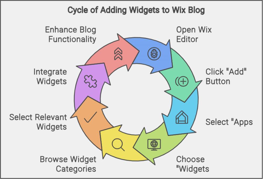
Adding widgets to your Wix blog is a crucial step in customizing and enhancing its functionality. Widgets are powerful tools that can greatly enhance the user experience and engage your readers. With a wide array of available widgets, you can easily tailor your blog to meet your specific needs and preferences. To add widgets to your Wix blog, navigate to the Wix Editor and click on the “Add” button located in the left-hand toolbar. 

From there, select “Apps” and then choose “Widgets.” A vast selection of widgets will be presented, allowing you to browse through various categories such as social media, contact forms, galleries, calendars, and more. When it comes to selecting which widgets to add to your blog, consider the overall purpose of your blog and how you want it to function. 

Adding widgets to your Wix blog

If you aim to promote engagement with your audience, including social media buttons widget allows visitors to easily share your posts across different platforms, thereby expanding the reach of your content. If you have events or important dates that you want to showcase on your blog, adding a calendar widget enables easy display and management of upcoming events. 

Don’t forget about incorporating widgets that optimize blog performance and promotion. For instance, implementing an email subscription widget allows users to subscribe directly from within the blog itself—an effective way of building a loyal reader base while also enabling seamless communication with subscribers. 

Integrating a search bar widget enhances user navigation by allowing them to quickly find specific content they may be interested in. By strategically selecting relevant widgets for customization purposes in line with both aesthetics and functionality goals for your Wix blog design project—whether it’s incorporating social media buttons for enhanced sharing capabilities or utilizing subscription tools.

A well-rounded customization approach will not only elevate its visual appeal but also provide an intuitive user experience that encourages reader engagement and promotes overall success in branding efforts. adding widgets is an essential aspect of customizing your Wix blog. 

By thoughtfully selecting and integrating widgets that align with your blog’s goals and target audience, you can significantly enhance its overall functionality, engagement, and branding. Whether it’s incorporating social media buttons to facilitate content sharing or using subscription tools to build a loyal reader base, widgets play a pivotal role in optimizing your blog’s performance and promoting its success. 

Embrace the vast range of widget options available within the Wix Editor, and let your creativity flourish as you tailor your blog to achieve the desired level of customization and user experience. As the future of the Wix blog continues to evolve, embracing these best practices will undoubtedly position your blog at the forefront of innovation in design and functionality. 

How to change the blog’s colors and fonts

Customizing your Wix blog is changing the blog’s colors and fonts. This step plays a vital role in creating a visually appealing and harmonious design that reflects your brand or personal style. 

When it comes to selecting the right colors for your blog, it’s crucial to consider your overall branding strategy. If you already have established brand colors, incorporating them into your blog design will help maintain consistency across all platforms. 

If you’re starting from scratch or looking for a new color scheme, take some time to explore color psychology and how different hues can evoke specific emotions or convey particular meanings. Once you’ve determined the color palette for your Wix blog, it’s time to implement those colors throughout various elements of your website. 

In Wix, this can be easily achieved through the Design panel within the editor. You can select individual elements such as headers, body text, links, and buttons and apply specific colors to each one. 

It’s essential to strike a balance between using consistent colors across different sections while also ensuring readability and accessibility for your readers. Remember that choosing contrasting colors for text and background is crucial for legibility purposes.

To change colors, you should also pay attention to customizing fonts on your Wix blog. Typography plays an integral role in conveying the personality and tone of your content while enhancing readability. 

When choosing fonts for headings and body text on your blog, consider factors such as legibility on different devices, screen sizes, and compatibility with various browsers. Wix provides an extensive library of fonts that cater to different styles and preferences. 

Experiment with combinations that complement each other well – perhaps pairing a bold sans-serif font with a more elegant serif font – but ensure consistency throughout the entire site. By taking advantage of Wix’s customization options for changing both colors and fonts on your blog pages, you have full control over creating a visually captivating presentation that aligns with your blog’s branding and design goals. 

Remember that your choices should not only attract attention but also enhance readability and user experience. Take the time to experiment with different color schemes and font combinations until you find the perfect balance that reflects your unique style, thereby elevating your blog’s overall aesthetic appeal. 

How to add social media buttons to your blog

Adding social media buttons to your Wix blog is a crucial aspect of blog customization as it allows you to expand your reach and engage with a wider audience. These buttons provide convenient shortcuts for readers to share your blog content on various social media platforms, thereby increasing its visibility and promoting your brand. 

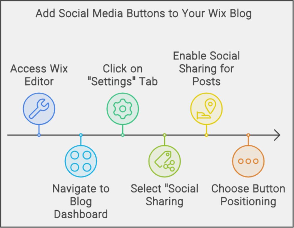
To incorporate social media buttons into your Wix blog seamlessly, follow these simple yet effective steps. Firstly, navigate to the Wix Editor and access your blog’s dashboard. 

From there, click on the “Settings” tab and select “Social Sharing.” Here, you can enable the social sharing option for each post or choose to activate it universally across all posts. Next, choose the desired positioning for the social media buttons on your blog page – commonly placed at the top or bottom of each post or in a floating sidebar. 

To further customize the appearance of these buttons, you can modify their style and display options. Wix allows you to select from various button designs that align with your overall blog theme and branding. 

Additionally, you have control over how many sharing options are available, tailoring them based on which platforms are most relevant to your target audience. Remember that ensuring consistency between your chosen colors and fonts is imperative for maintaining a cohesive brand image throughout your entire blog design. 

Add Social Media

In addition to integrating social media buttons into individual posts, it is also beneficial to include them in other prominent areas of your blog design. Placing these buttons strategically in visible locations such as the header or sidebar encourages readers to connect with you on different platforms beyond simply sharing content. 

By fostering engagement through well-placed social media icons, you are not only expanding brand awareness but also establishing credibility as an active participant in relevant online communities. Adding social media buttons is an integral part of optimizing and customizing a Wix blog effectively. 

By taking advantage of this feature’s versatility within the Wix Editor, bloggers can fine-tune their button placement, style, and display options to align with their overall blog branding. Incorporating these buttons into strategic areas of the blog design creates opportunities for increased social media engagement, ultimately driving traffic to your blog and enhancing its overall performance. 

How to add images and videos to your blog

Adding images and videos to your Wix blog is an excellent way to enhance the visual appeal of your content and engage your readers on a deeper level. Including captivating visuals can help you convey information more effectively, break up text-heavy sections, and make your blog posts more shareable on social media platforms. To ensure you make the most out of this feature, here are some best practices to follow when incorporating images and videos into your blog. 

When it comes to images, it’s crucial to choose high-quality visuals that align with your blog’s theme and overall branding. A well-curated selection of images can elevate the aesthetic appeal of your posts while reinforcing your blog’s identity. 

Consider using professional photographs, eye-catching graphics, or even original illustrations that complement the written content. Additionally, ensure that the dimensions of the image fit well within your chosen blog theme without compromising its resolution or cropping out essential elements. 

As for videos, Wix provides various options for embedding them seamlessly into your blog posts. Whether you’re uploading videos directly from your device or embedding them from popular platforms like YouTube or Vimeo, there are a few key points to consider for optimal presentation. 

First and foremost, make sure the video is relevant to the topic being discussed in the post and adds value to readers’ understanding. It should also be visually appealing with clear audio quality to captivate viewers’ attention throughout its duration. 

Proper placement of images and videos within your blog posts is equally important for an optimal reader experience. Strategically intersperse visuals throughout the text rather than lumping them all together in one section. 

This approach helps maintain a balanced visual flow while simultaneously keeping readers engaged as they progress through each paragraph. Remember that while visuals can significantly enhance a blog post, moderation is key. 

Avoid overwhelming readers with an excessive number of images or lengthy videos that may slow down page loading times or distract from the main focus of your content. Find a balance between captivating visuals and well-crafted written content to ensure a harmonious reading experience for your audience. 

Best Practices for Wix Blog Customization

By following these best practices, you can effectively incorporate images and videos into your Wix blog, enhancing its visual appeal and giving readers an immersive experience that complements your written content. With the right selection, placement, and moderation of visuals, you can create an aesthetically pleasing and engaging blog that truly stands out in the vast landscape of online content. 

Conclusion:

The customization of your Wix blog is not merely an aesthetic choice but a crucial step in establishing your online brand and maximizing its impact. By carefully selecting a blog theme that aligns with your content and audience, you can create a cohesive visual identity that reflects your unique style and expertise. 

The use of widgets enhances the functionality of your blog, allowing you to integrate various interactive elements such as social media feeds or email subscription forms. Paying attention to the colors and fonts used in your blog design can significantly contribute to capturing visitors’ attention and conveying the desired tone or mood. 

A thoughtful selection of these elements creates an immersive reading experience while maintaining consistency with your overall branding strategy. Adding social media buttons encourages readers to engage with your content beyond the blog, amplifying its reach through shares and likes across different platforms. 

The inclusion of compelling images and videos within your blog posts adds depth and visual appeal, enhancing reader engagement and making complex concepts more accessible. Optimizing these multimedia elements for fast loading times ensures smooth navigation for users while maintaining optimal performance.

Proper branding throughout your blog promotes recognition, fosters trust among readers, and establishes credibility within your niche or industry. As technology evolves rapidly, so does the future of Wix blog customization. 

With continuous updates to features and functionalities, it is expected that Wix will further enhance customization options for bloggers across various industries. This could include more advanced design capabilities, additional integrations with popular tools or platforms, as well as improved performance optimization features. 

Personalizing your Wix blog through a careful selection of themes, widgets, color schemes, fonts, social media buttons, and multimedia elements is essential for creating a visually appealing platform that resonates with readers while reinforcing brand identity.

By staying attuned to advancements in Wix’s blogging platform, such as potential future enhancements in customization options, you can ensure continued success in delivering exceptional content experiences to your audience while achieving your blogging goals. 

The importance of branding your blog

Your blog’s branding encompasses its unique identity, voice, and visual aesthetics. It is what sets your blog apart from others and helps establish a memorable and recognizable presence online.

One key aspect of branding your blog is ensuring consistency in its design elements. This includes choosing the right color scheme that aligns with your blog’s theme and content. The colors you select should evoke the emotions and feelings you want to associate with your brand. 

If your blog focuses on wellness and self-care, calming tones like blues or greens might be suitable for creating a sense of tranquility. On the other hand, vibrant colors like reds or oranges can convey energy and excitement for blogs centered around adventure or entertainment.

To colors, typography plays a significant role in reinforcing your brand’s personality. Carefully selecting appropriate fonts that reflect the tone of your content is crucial for establishing a cohesive brand image. 

Fonts can range from clean and professional to playful and whimsical, depending on the nature of your blog’s focus. Consistently using these fonts throughout the website will enhance visual consistency while adding an extra layer of professionalism to your overall presentation.

Branding also extends beyond visual elements. it encompasses how you communicate with your audience as well. Developing a consistent tone and voice for your writing helps establish familiarity with readers over time. 

It is friendly and conversational or authoritative and informative, maintaining this consistent voice across all blog posts creates a sense of reliability that keeps readers engaged. By investing time into carefully crafting the branding elements of your Wix blog, you lay a strong foundation for long-term success in terms of both audience engagement and recognition within the saturated blogging landscape. 

A well-branded blog not only adds credibility but also facilitates trust-building among readers who become familiar with its distinct characteristics over time. Effective branding goes hand in hand with blog promotion and optimization. 

Once you have established a strong brand identity, it becomes easier to market your blog across various platforms and channels. When readers encounter your blog’s branding elements consistently, whether through social media buttons or promotion, they are more likely to recognize and engage with your content. 

Branding is an integral part of customizing your Wix blog and plays a crucial role in determining its success. By carefully selecting colors, and fonts, and maintaining a consistent voice throughout your content, you create a recognizable identity that resonates with your audience.

Effective branding enables streamlined promotion and optimization efforts for increased visibility. As the future of Wix blog customization continues to evolve, prioritizing branding will remain essential in establishing a strong online presence for bloggers seeking to stand out from the crowd. 

The future of Wix blog customization

For website design and content creation, it is imperative to consider the future of Wix blog customization. With technology advancing at a rapid pace, the Wix blog will likely continue to introduce new features and functionalities to enhance the customization options available to users.

This opens up exciting possibilities for bloggers to create unique and visually captivating platforms that truly reflect their brand identity. Wix blog customization is the integration of more interactive elements. As we move forward, blogs will become more than just textual content, they will transform into immersive multimedia experiences. 

The use of blog videos will become increasingly popular, allowing bloggers to engage their audience through dynamic visual storytelling. There may be advancements in incorporating augmented reality (AR) or virtual reality (VR) elements into blogs, providing an even more immersive experience for readers. 

As branding becomes an integral part of any successful online presence, Wix blog customization will focus on offering users enhanced options for branding their platforms. This may include expanded font libraries, allowing bloggers to choose from a wider range of fonts that align with their brand image. 

The ability to customize colors and design elements will also play a crucial role in creating visually appealing and cohesive blog designs. In terms of performance optimization, the future of Wix blog customization lies in providing users with tools and widgets that improve website speed and user experience. 

Bloggers will have access to advanced analytics and SEO features within the platform itself, enabling them to optimize their blogs for search engine visibility and audience engagement. Ultimately, as Wix continues its commitment to innovation in web design tools and technologies, we can expect continuous improvements in blog customization options. 

With a keen eye on user feedback and industry trends, Wix’s future developments are likely to empower bloggers with even greater flexibility in shaping their online presence through customized blogs. By embracing these emerging trends in design and functionality while staying true to their branding, bloggers can create captivating and highly personalized platforms that leave a lasting impact on their audience.